

Problems to be solved
Print on demand (POD)
Accessibility
Taxonomy


The move to POD saved paper and expense but resulted in inconsistent color printing.
The original color-based categorization system predated the industry’s focus on accessibility.
Mapping of colors to topics became problematic as books covered multiple topics. With eleven new main content categories, the color-based system would become unmanageable from a content strategy perspective, as well as visually overwhelming.
Evolving a beloved brand for a more accessible, modern future
In 2000, Publishers Weekly declared "The Internet Was Built With O'Reilly Books." In 2025, with a bold new series design, O’Reilly’s books continue to shape the future of technology, with bestselling titles like AI Engineering by Chip Huyen leading the way.
The challenge
O’Reilly needed to modernize its iconic animal books to meet new accessibility, taxonomy, and print-on-demand requirements—without losing what made them legendary.
My role
I drove the vision from strategy through art direction and pitched the concept that won over leadership.
Team
Creative strategy / art direction / executive presentation
Ellie V
Cover design / illustration
Karen Montgomery

This was a mission
I’ve told people I design these books and seen their faces light up as they exclaim, “I learned to code from those books!” My husband learned to code from the animal books. I was lucky enough to have learned to design animal books from the original creator of the series, which has defined the O’Reilly brand through 50 years of visual trends.
When it was clear we needed to update the series due to changes in business strategy, brand visual evolution, printing process, and accessibility standards, it wasn’t a standard work project, it was a mission for me. We needed to preserve the magic and original purpose of the animals, which is to make the brand stand out and to spark curiosity.
Pillars
Lean into white, a core brand color
Free the topics from color categorization
Put color into the animals, which adds surprise and delight for readers
Move to Gilroy, a more modern geometric font, for titles
Design strategy
As leadership was making significant changes to the business focus and brand strategy, I picked up on signals that exec was thinking this series looked out of date. I proactively proposed a redesign.
Our strategy moved away from rigid color blocks that signified topics, which were becoming increasingly intertwined. Since white had always been a core brand color, I proposed moving to a pure white cover and incorporating color into the black-and-white animal engravings. We leveraged in-house talent to bring this approach to the broader series, enhancing its richness and visual appeal.
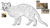
Illustration process
First, we reduce the line work in the antique black and white engravings. Our lead artist developed a library of Photoshop brushes used to create texture and shading. Artists reference photos of each animal to produce accurate color and pattern. Recently, we’ve evolved the process to preserve more of the original linework in the 19th-century engravings.
Impact
The animals are the emotion
The animals evoke emotion—the North Star of any brand. But for ambitious new executives, 19th-century black-and-white engravings on computer books can feel like relics. I envisioned a path forward that honored the animals’ original role while evolving the design to reflect a bold, modern brand.
Accessibility
Simplifying our color use improved color consistency in print, resulting in cleaner and more professional-looking bookshelves.
Taxonomy
By removing color-based categorization, we made the series more inclusive and compliant with accessibility standards.
Social proof

.png)